

1
/
of
4
Marlboro x Napoleon Crossing the Alps
Marlboro x Napoleon Crossing the Alps
Regular price
$25.00 AUD
Regular price
Sale price
$25.00 AUD
Unit price
/
per
Couldn't load pickup availability
Premium Poster - Matte White Finish.
BUY ANY TWO POSTERS GET 20% OFF.
BUY THREE = Free Shipping.
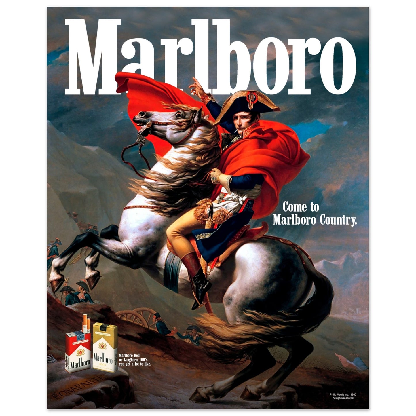
Marlboro.
While they didn’t invent the brand personality, Marlboro perfected the concept with the Marlboro Man. The Marlboro Man is solitary, often depicted as a rugged, cowboy-type figure in a picturesque landscape.
Reinforced with strong messaging like “Come to Marlboro Country”, the ads invite smokers into an exclusive world of adventure. “Marlboro Country”, to me, is a metaphorical place where the ‘Marlboro Man’ already is, and by smoking Marlboro’s, you become associated with that little utopia of cowboys and cancer.
The Painting.
Napoleon Crossing the Alps by Jacques-Louis David (1801-1805), depicts Napoleon and his military on their way to defeat the Austrians at the Battle of Marengo.
Depicted with clear authority, Napoleon points toward the mountain summit, the journey ahead. His horse is destressed, in contrast to Napoleon’s calm expression. This helps demonstrate his ability to wield power with ease, able to conquer anything before him. To me, his gesture to the sky suggests an invitation, “Join Us”. It’s this gesture for adventure (war) that initially sparked my interest in the painting. I decided to use the Belvedere version, partly because its colours perfectly resemble Marlboro.
The Poster.
The colour composition, the authoritative expression, the gesture for adventure, Napoleon himself, the horse, all these things inspired me to combine this painting with Marlboro.
The slogan ‘Come to Marlboro Country’ works perfectly when aligned with this painting and its context. While the original slogan implies the ‘Man’ is already in Marlboro Country, here, it acts more of an invitation to join Napoleon on his journey to “where the flavour is”.
Traditional Marlboro ads show the products floating on the page, whereas here I decided to place them in the setting, casting a shadow over the rocks. Their placement acts as the final point of exploration as you admire the poster. Starting with the logo at the top, followed by his hand and cape, flowing down the horse and ending at the iconic packaging.
Share